· Andre Sattler
5 Churn Prediction Signals Hiding in Your B2B SaaS Product Data
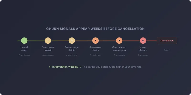
By the time a B2B SaaS customer sends a cancellation email, the decision was made weeks ago. Usually months ago.
The warning signs were in your product data the entire time. Most teams just never see them — because churn prediction at the account level requires usage tracking that’s painful to build and maintain manually.
Here are five churn prediction signals that show up in product data long before they show up in your revenue metrics — and what to do when you spot them.
1. Fewer people are using the product
In most B2B SaaS accounts, usage depends on a handful of people. When the number of active users on an account starts dropping, something is wrong — even if total session counts haven’t fallen off a cliff yet.
Maybe one person left the company. Maybe the team decided to consolidate around a different tool. Maybe the person who set everything up went on vacation and nobody else knows how it works. The reason matters, but the signal is the same: fewer people logging in means the product is losing its grip on the account.
This is one of the earliest churn signals you can catch, because it often precedes the more dramatic drops in overall usage.
What to watch for:
- The number of distinct active users on the account declining over 2-4 weeks
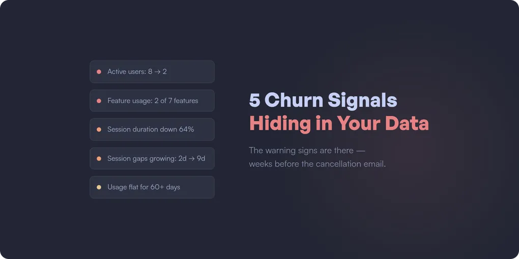
- An account that went from 8 active users to 2 — even if those 2 are still using it heavily
- Accounts where usage was always concentrated on one or two people (high risk from the start)
What to do: Reach out and find out what changed. If a key user left, help the account identify someone new to own the product internally. If the remaining users are still active, that’s your window — they haven’t decided to leave yet, but the account is fragile.
2. Feature usage shrinks to the minimum
Healthy accounts use multiple features. They explore, they adopt new capabilities, they find ways to integrate the product deeper into their workflow.
When an account that used to touch five features starts using only one or two, they’re retreating to the bare minimum. They’re getting less value from your product, which means they’re easier to replace.
This signal is especially dangerous when the remaining feature is something commoditized — if they’re only using your reporting feature and ignoring everything else, a spreadsheet might replace you.
What to watch for:
- Number of distinct features used per account declining over 30 days
- Accounts that never adopted features beyond the initial use case
- Power users reverting to basic functionality
- The features they’re still using are available in cheaper alternatives
What to do: This is a product and CS problem together. Are the abandoned features hard to use, or did the customer’s needs change? Sometimes they just never figured out the more advanced stuff. Often a 15-minute walkthrough of the features they’re ignoring is enough to re-engage an account.
3. Sessions get shorter and shallower
An account might still be logging in — but what they do inside the product tells a different story. Sessions that used to last 20 minutes now last 3. Users that used to navigate through multiple features now hit one page and leave.
This is the “going through the motions” signal. The account hasn’t fully disengaged — they’re still showing up — but the depth of their engagement is fading. They’re checking in out of habit, not because the product is part of their workflow.
This signal is easy to miss if you only track session counts. Ten sessions per week sounds healthy — until you notice each one is a 90-second bounce.
What to watch for:
- Average session duration per account declining over 2-4 weeks
- Fewer pages visited per session than the account’s historical average
- Users navigating to the same single page every session instead of exploring
- The decline is gradual, not sudden (sudden drops are usually signal 1 or 4)
What to do: This often means the product isn’t delivering enough value to justify deeper engagement. Look at what the account used to do versus what they do now — which workflows did they abandon? A targeted check-in about those specific features can resurface value they forgot about.
4. The gaps between sessions keep growing
This one is subtle. The account is still active — they haven’t disappeared. But the rhythm is slowing down. Sessions that used to happen every day now happen every three days. Then once a week. Then once every two weeks.
The key insight: relative decline from the account’s own baseline is far more predictive than absolute thresholds. An account that normally has 20 sessions per week dropping to 8 is a stronger signal than an account that’s always had 5 sessions per week staying at 5. Every account has its own rhythm — the danger is when that rhythm changes.
This signal catches the slow drift that raw session counts can miss. An account going from daily to every-three-days doesn’t look alarming in a weekly report. But it’s the beginning of a pattern that ends in cancellation.
What to watch for:
- Average time between sessions per account increasing over 2-4 weeks
- The change is relative to the account’s own historical pattern, not an absolute number
- The lengthening gaps are across the whole account, not just one user
- The change happens outside of normal seasonal patterns (holidays, end of quarter)
What to do: Reach out — but not with a “we noticed you haven’t logged in” email. Nobody likes those. A genuine check-in works better: “How’s your experience going? Anything we can help with?” Often there’s a specific frustration or a workflow change behind the drift.
5. Usage plateaus at the trial level
Some accounts sign up, complete onboarding, use the product at a basic level — and never go deeper. They’re technically “active” — they log in, they do the minimum — but they never reach the level of adoption where the product becomes indispensable.
These accounts are the silent churn risk. They won’t show up in “declining usage” alerts because their usage isn’t declining — it was never high enough. They’re coasting at a level where switching costs are near zero.
What to watch for:
- Accounts active for 60+ days but using fewer features than the average 14-day-old account
- No growth in usage over time (flat logins, flat feature adoption, flat data volume)
- The account hits the same 2-3 pages every session and never explores
What to do: These accounts need re-onboarding. They got stuck at a basic level and never discovered the value that makes customers stay. Offer a walkthrough focused on the features that differentiate long-term customers from churned ones — and look at why the natural discovery paths aren’t working in the first place.
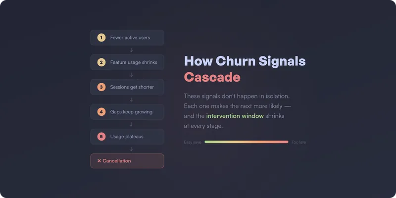
How these signals cascade
These five signals don’t happen in isolation. In practice, they cascade:
Fewer people use the product (signal 1) → the remaining users retreat to basic features (signal 2) → sessions get shorter and shallower (signal 3) → the gaps between sessions keep growing (signal 4) → usage plateaus at a level where switching costs are zero (signal 5) → cancellation.
The earlier in this chain you intervene, the higher your save rate. By signal 4 or 5, the account has already mentally churned — they just haven’t sent the email yet.
From signals to churn prediction
Every one of these signals has something in common: they’re visible in product usage data, and they show up weeks before the customer actually leaves. That’s what makes them churn prediction signals — not lagging indicators.
The challenge isn’t knowing what to look for. It’s having the right tracking in place to catch these patterns at the account level — and keeping that tracking accurate as the product evolves. In practice, building churn prediction from product data means defining dozens of events, building custom queries, and maintaining it all over time. Most teams don’t have the bandwidth. (This is part of a bigger problem — most analytics setups go unused because the maintenance burden is too high.)
How to get instant notifications when accounts show churn risk
Spotting these signals in a dashboard is one thing. Getting notified the moment they happen — before the account drifts further — is what actually saves revenue.
The ideal churn prediction setup doesn’t wait for someone to check a report. It pushes alerts to the people who can act on them, in the tools they already use:
- Email alerts — a daily or weekly digest of accounts showing risk signals, sent directly to CS leads or account managers. No dashboard login required.
- Slack notifications — real-time alerts in a dedicated channel when an account crosses a risk threshold. The team sees it, discusses it, and acts on it — all in the same place.
- CRM alerts (HubSpot, etc.) — churn risk signals surfaced directly on the account record, so your CS team sees risk context right next to their notes, tickets, and renewal dates. No tab-switching, no separate tool.
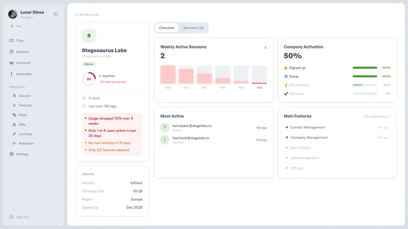
The key is that these alerts are account-level and contextual. Not “user X didn’t log in” — but “this account’s active user count dropped 60% over two weeks, session depth is declining, and they’ve stopped using three features they relied on last month.” That context is what makes the difference between a generic check-in and an intervention that actually saves the account.
This is what we’re building at Lunar Dinos. Our product graph maps your application automatically from real usage — no event definitions, no manual configuration. Account-level health scores surface changes in behavior as they happen, and alerts go out automatically via email, Slack, or directly into your CRM — so your CS team can intervene while the window is still open.
If you want to predict churn instead of reacting to it, join our waitlist or book a demo.
— Andre